Teravera
Brand identity and packaging for Teravera, a subscription box of organic Italian products, drawn from the country's landscapes and biodiversity.
Start a project- Client
- Teravera
- Year
- 2020
- Sector
- Food
- Work
- Branding, Packaging
Italy is famous for its biodiversity: a varied country made of many different realities, with a centuries-old culture passed down from generation to generation, which makes Italian food some of the best in the world. Teravera is a subscription box of organic products from across Italy. Each month it selects four food and wine excellences from small local producers. Its mission is to show what Italy has to offer beyond the biggest and most iconic brands. Its uniqueness comes from the traditions and the people who have made it a way of life.
What I did
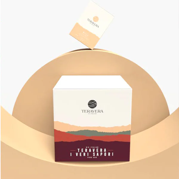
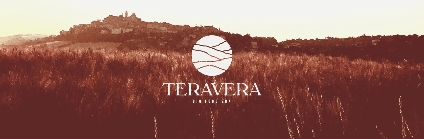
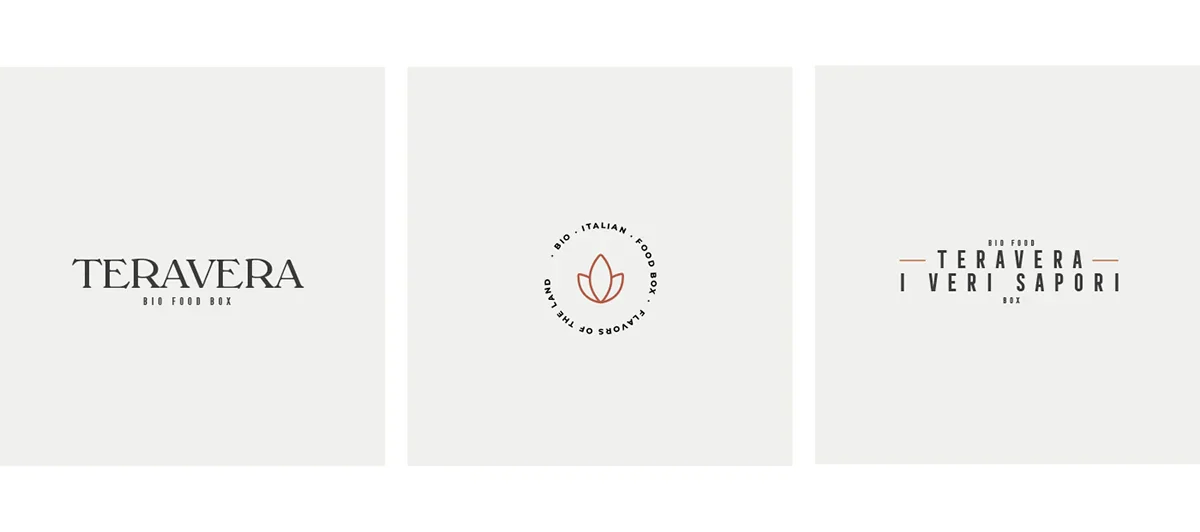
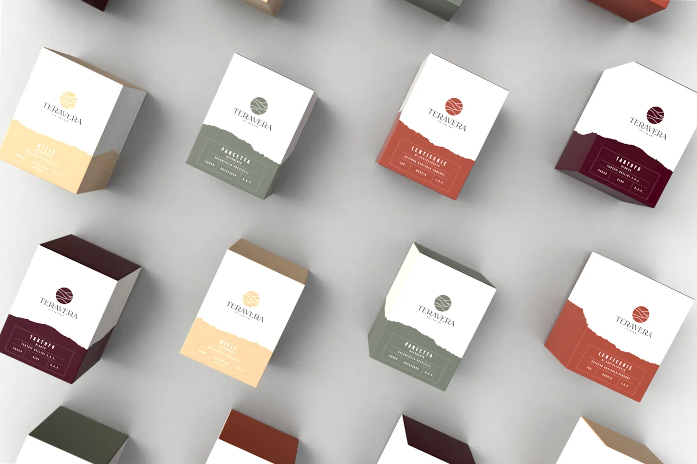
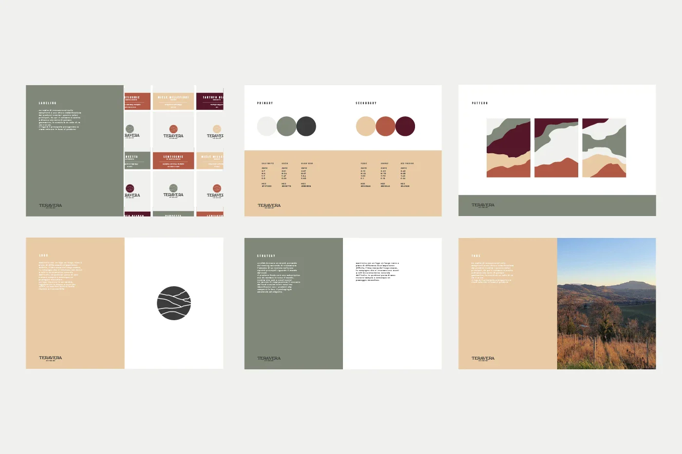
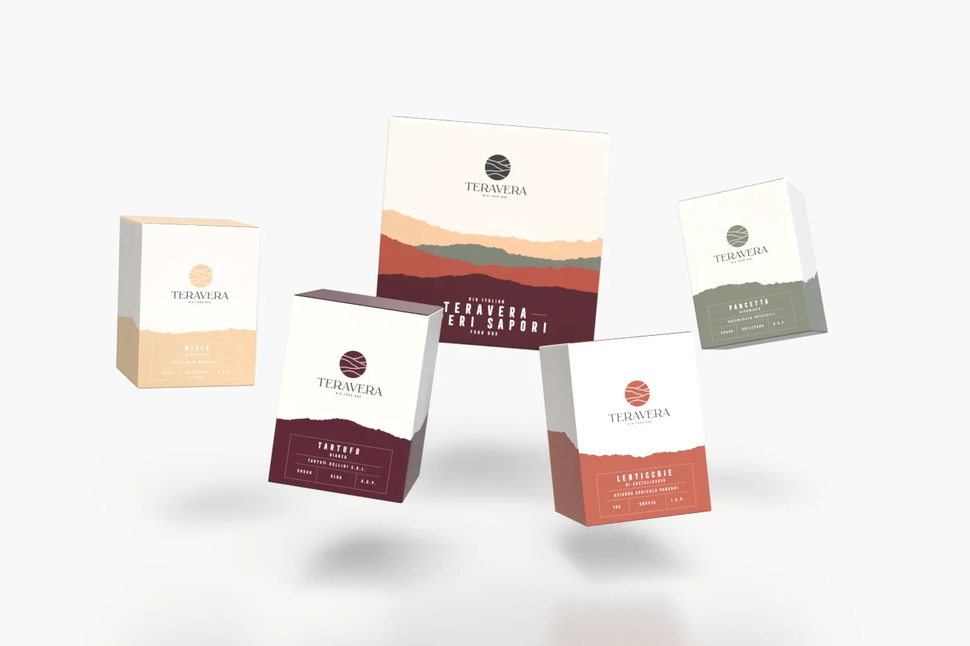
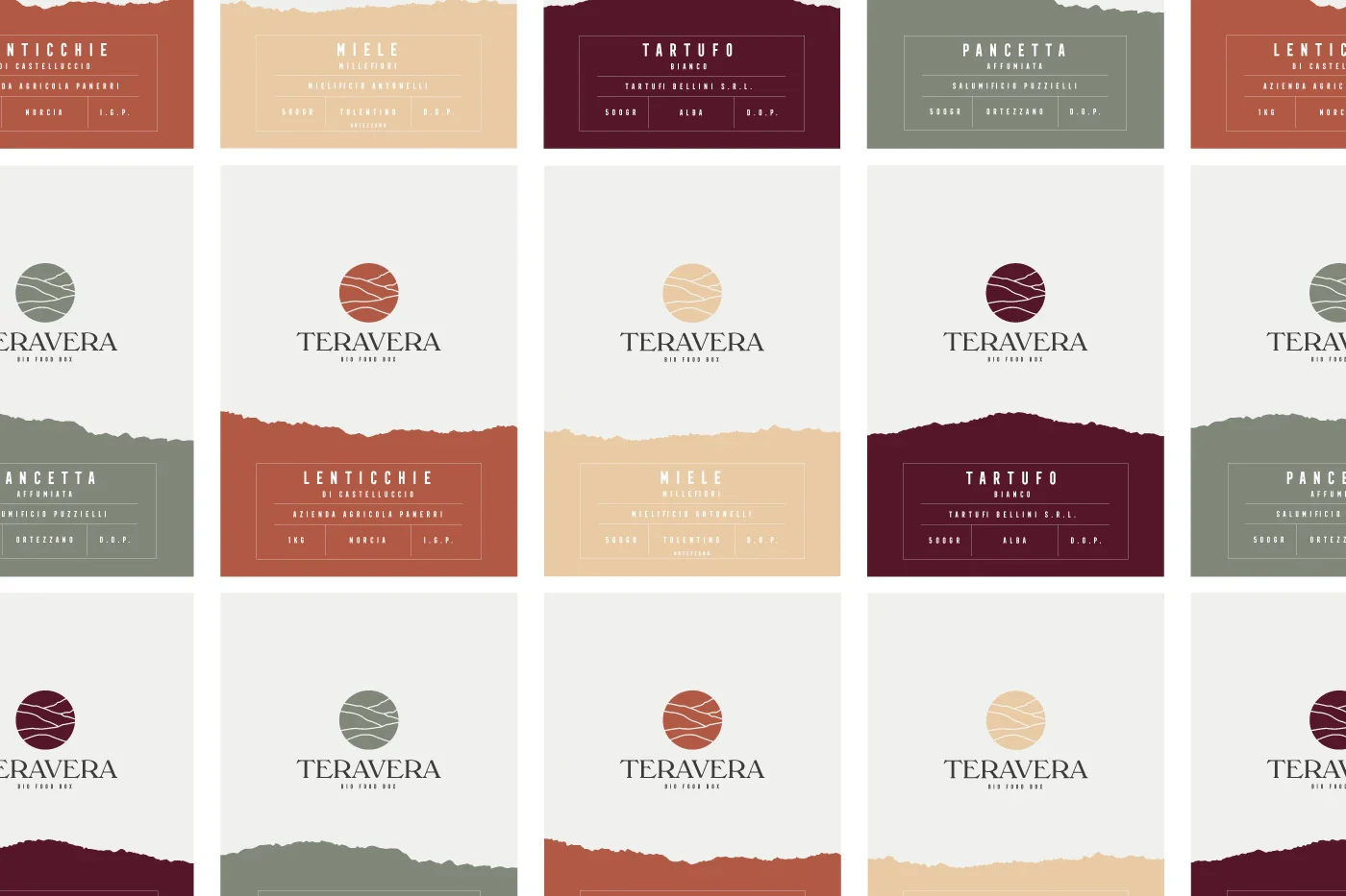
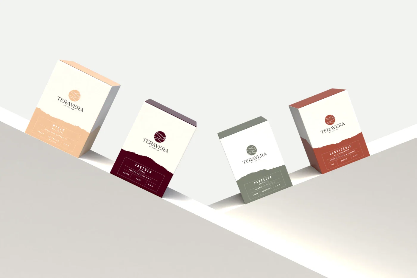
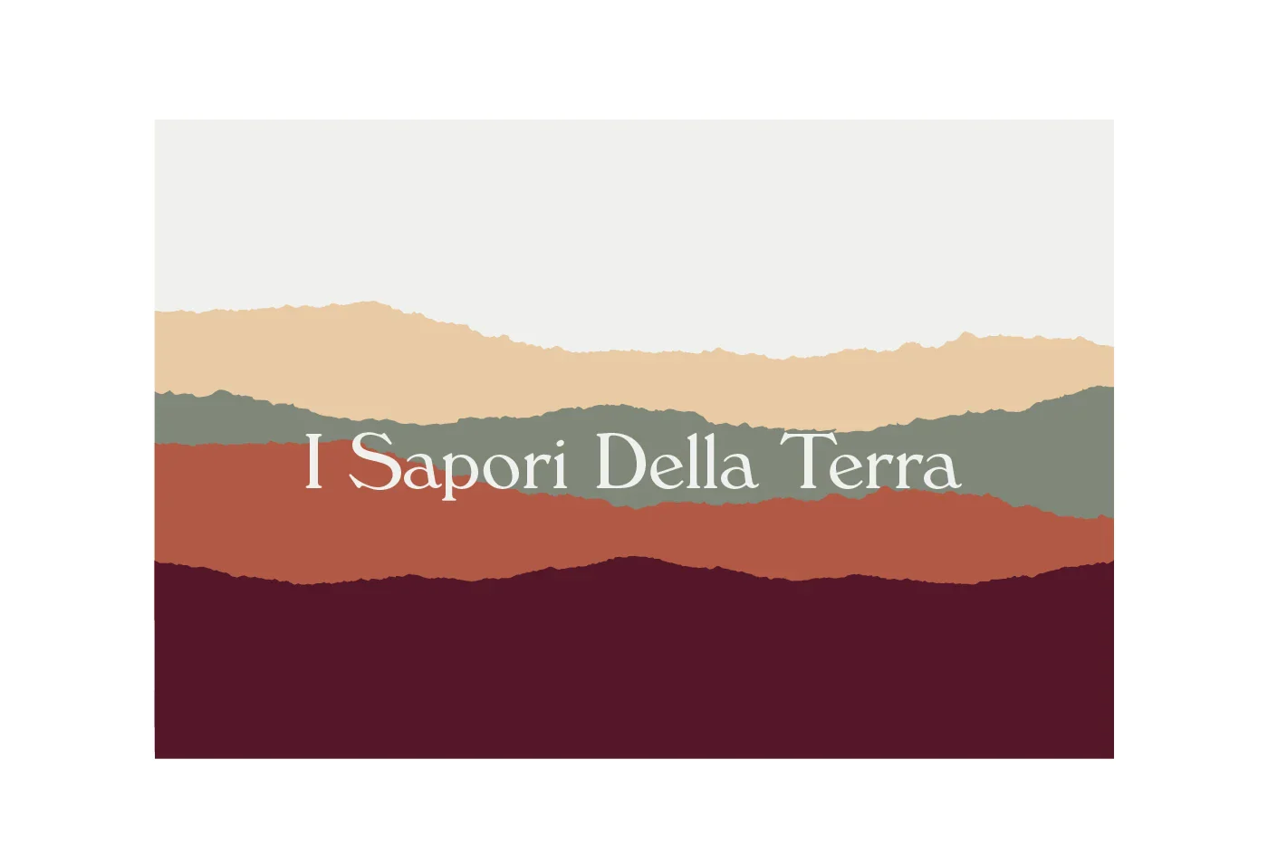
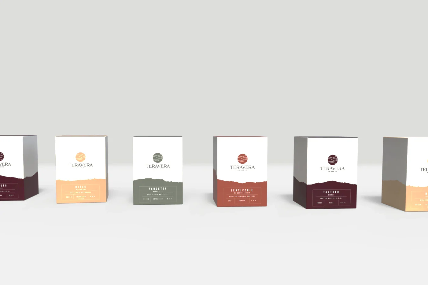
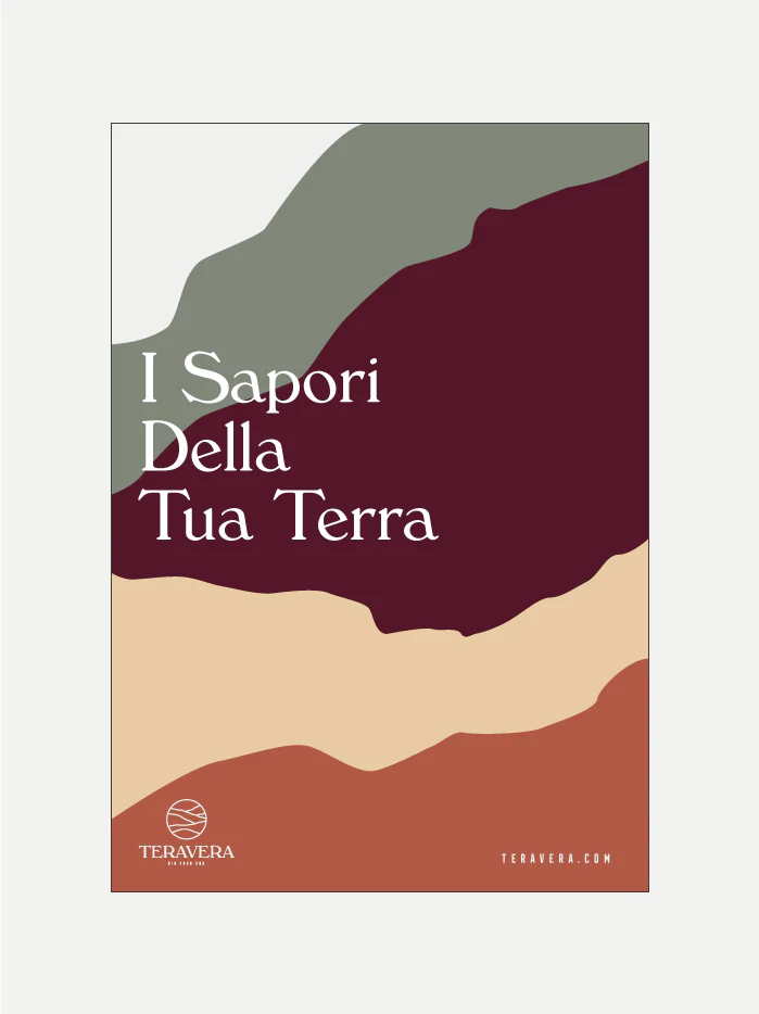
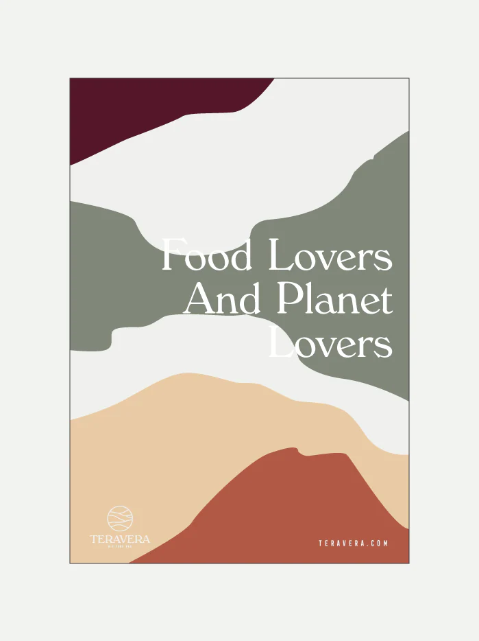
I based the design on the Italian landscape, reproducing its iconic scenery: green hills that meet bold mountains and run down to sun-kissed plains. These landscapes appear in both the logo and the packaging design. The colors represent biodiversity: bright tones that vibrate and become more elegant in the design of the individual boxes.
The brief
Creating a visual identity for a subscription box that celebrates the biodiversity and excellence of the Italian territory, conveying the authenticity and quality of local organic products through a design that reflects Italian landscapes.
Next project
 Logos & Marks Vol. 01, logo collection